
Rebuilding the Atlassian Design System
Duration
Mar 2016 - Dec 2018
Product and team
Atlassian Platform
Core Design System
Role
enterprise design systems, audits, visual design, component libraries, accessibility, team enablement
In 2016, Atlassian set out on a mission to unleash the potential of every team on the cloud. It was a bold leap that promised a scalable platform built for real-time collaboration. This technical transformation came hand-in-hand with a creative one. A rare chance to reimagine our brand personality and rebuild our design system from the ground up.
I was proud to be part of this company-wide initiative. With a deep love for modular systems, I joined the cross-functional mission to craft the visual and functional language of Atlassian’s next chapter. And while a design system is never truly done, this case study shares the journey to our first major milestone — the soft launch of ADG 3.0.
OVERVIEW
The building blocks for quality and scale
Atlassian’s design system helps teams create simple, intuitive and beautiful experiences. It’s a living system and constantly evolving to accommodate the needs and scale of Atlassian’s platform and multi-product offerings including Jira, Confluence, Bitbucket and Trello.
Before and after
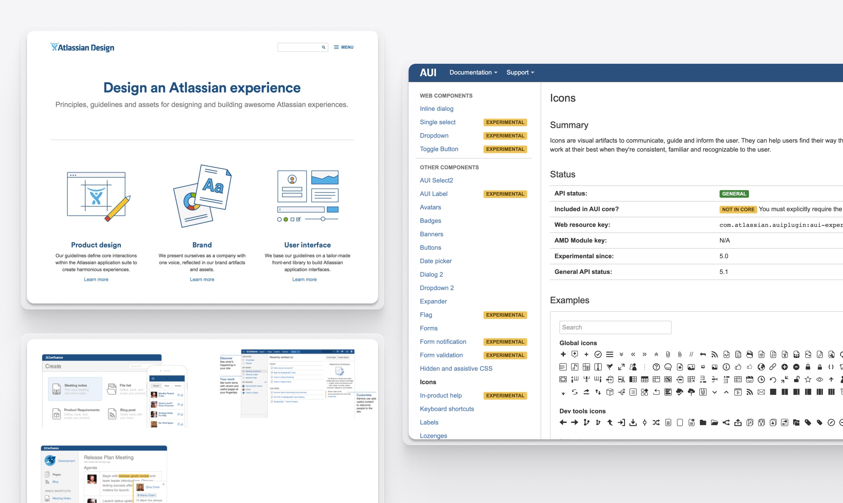
Before: Our previous design system, ADG2/AUI, had helped us address early scaling challenges for individual products. But over time without a dedicated team, the inconsistency crept in. Design guidelines, code components, and brand resources were scattered across disconnected resources, making it harder to maintain, harder to find, and harder to trust.
↓

After: With ADG3/Atlaskit, we rebuilt from the ground up to create a unified language on a single platform. This allowed us to:
Improve overall quality through consistent and scalable experiences
Give teams more time to focus on high-impact customer experiences
Speed up development efforts by providing flexible building blocks
This time, our system also needed to account for shared patterns across products such as the editor, group avatars, mentions, and media files. Shaping a foundation fit for cross-product collaboration and scale.
KEY PHASES
Phase 1: Teaming up for a strong foundation
Together with Creative Marketing, we envisioned how Atlassian’s brand personality could come to life across every touchpoint - from that very first click on the marketing site to the everyday moments inside our products. This personality would become the foundation for how we build and scale every Atlassian experience.

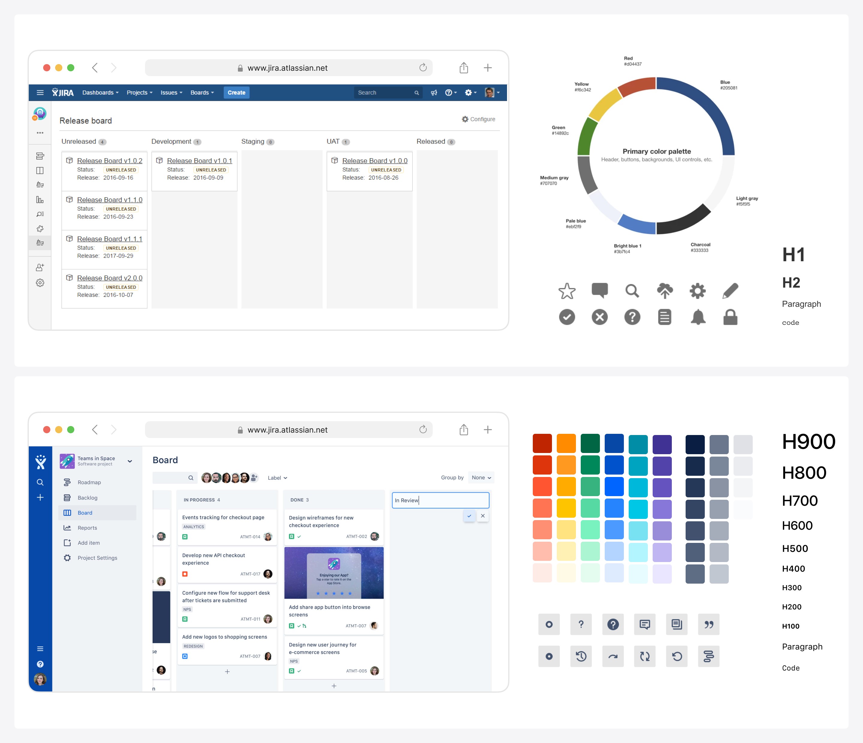
To make our personality shine, we needed style. We translated that personality into our core building blocks such as illustrations, typography, iconography, grids, and colour. In a four week spike, we explored a plethora of possibilities. Marketing leaned toward bold expression, while product leaned toward refined pragmatism.
I started by auditing interfaces across Atlassian products to spot common patterns and identify what made us uniquely “Atlassian”, especially in our role as a tool for software teams. Then came the fun part: experimenting with layouts to see how our foundations work in context. We invited guest designers from Jira, Bitbucket, HipChat and Confluence to join the spike for extra creative firepower. Every day ended with a round of feedback and fresh ideas to explore the next morning. Once we had alignment with leadership, we shared our vision at a global town hall. It was a major milestone that secured buy-in across the company.
Phase 2: Designing components
As our mission rolled into the roadmaps of product teams, I worked with cross-functional members to identify the most essential components needed and prioritised them into design sprints.

I regularly initiated conversations with product designers across teams to understand how components were used in real contexts. More complex decisions were worked through in dedicated workshops. While each component had its nuances, our process remained consistent. The toughest challenges often fell into three areas:
Meeting modern web standards (accessibility, responsiveness, performance)
Defining the core purpose and expected behaviour of each component
Designing solutions rooted in shared patterns, but flexible enough to scale across multiple enterprise products
To bring components to life, I collaborated closely with dedicated front-end engineers. I especially enjoyed applying React thinking, exploring component anatomy, mapping states, and prototyping interactions. Everything we built was pushed to an internal testing environment so the broader company could provide feedback, which helped us iterate fast and build momentum.
Phase 3: Soft Launching ADG 3.0

To drive adoption of any design system, documentation is essential. People need to know not just what to use, but how and why. So once our components were coded into the Atlaskit library, I partnered with a content designer to write clear, opinionated usage guidelines, published on the Atlassian Design Guidelines (ADG) site.
When our core components were ready, we prepared for a soft launch. The night before going public, we ran a full internal review to catch any last-minute issues. Then we flipped the switch, announcing the launch internally.
POST-LAUNCH
Impact
The soft launch helped us build credibility, not just components.
ADG 3.0 became a trusted reference across design, engineering, and marketing, helping teams align decisions more easily.
Feedback loops with internal teams strengthened our roadmap and fostered a deeper sense of shared ownership.
Adoption grew organically as teams saw the value and began requesting patterns that better matched our evolving product landscape.
Tough questions like “dropdown vs select” pushed us to lead from first principles. I partnered with Thinkmill to explore more robust interaction models, laying groundwork for improvements to React Select.
There wasn't a single moment that signaled success. But the steady growth in engagement and adoption showed that a well-crafted system invites collaboration, not just compliance.
What I learned
Joining the design systems team early in my career shaped the way I think. I developed a strong foundation in systems thinking, sharpened my visual design skills, and learned how to give and receive critique in a way that moves the work forward. Here are some lessons that stayed with me:
A design system will always have moving parts and shared ownership, but code remains the single source of truth.
A strong system reflects real, evolving needs. Meaningful adoption happens when teams feel heard, supported, and invited to shape the system with you.
—
Footnote
Since the launch, the Atlassian Design System has continued to evolve to better serve the teams who rely on it every day. It’s been a real pleasure to watch it grow into something teams trust — and to see it recognised as one of the leading design systems that others look to for inspiration.
2017 — Company-wide rebrand
A bold new identity was rolled out across Atlassian, reflecting the company’s growth and evolving ambitions. The design system played a key role in helping bring that brand to life across every touchpoint.
2020 — A new home for the Atlassian Design System
The design system got a new, dedicated platform — making it easier for teams to explore, adopt and contribute to shared foundations.
—